



iOS 26 review one year later: Liquid Glass complaints hide the real problem
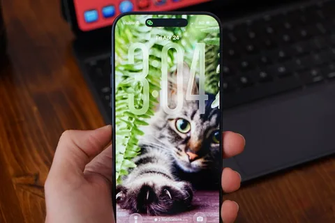
Most of the conversation around iOS 26 got lost behind social media's need for it to be as controversial a change as iOS 7. The bigger story is the lack of a revitalized Apple Intelligence. My iOS 26 review is going to focus on the changes that actually affected our day-to-day use of the iPhone . There are a lot of new features, app updates, and the Liquid Glass material, but the elephant in the room is the ongoing delays in AI. If you're here for me to pile onto the Apple failure bandwagon , this isn't the review for you. In fact, I am still fully of the opinion that Apple's admittedly embarrassingly slow start in artificial intelligence might be one of its biggest victories in tech in decades. Apple didn't plan for it to go this way, but boy is it shaping up to be quite the coup. The true winner of the AI race was the one that waited to start the race after all of the others paved the track and painted the finish line. I'll get to the AI of it all and my thoughts at the end of this review, but for now, let's actually discuss what iOS 26 actually gave us. iOS 26 one year later review: Liquid Glass As I sit here and write this on an iPad Pro connected to an external display, my Slide Over window of Drafts has a clear glass edge. The YouTube video playing underneath of the 2025 WWDC keynote bleeds through colors splashing across the edge of the video. iOS 26 review: Liquid Glass is more obvious in some places, less in others Liquid Glass wasn't limited to iOS 26, but I'll keep my conversation about it limited to that platform. The new material stands out most on the Home Screen and Lock Screen. Every Apple app quickly adopted the new material throughout. Popover lists are a smoky glass, icons and buttons have a distinct glassy edge, and everything is reflective. If an object moves in front of another object, some of the underlying layer peeks through. Grab an element and it warps and moves as you interact with it. Sliders behave like bubbles while more elements move into menus. The entire design philosophy focuses on minimalist presentation with flashy visuals. iOS 26 review: Liquid Glass changed how elements looked across the platform The driving force behind Liquid Glass is Apple Silicon . I have no doubt that Apple's claims about other smartphones being unable to replicate the material are true. I personally enjoyed the introduction of Liquid Glass. It had its flaws, and still does, but it was an interesting departure from the flat and boring state iOS was in. The biggest winner of Liquid Glass was the intuitive UI interactions. When you tap a button, the menu appears where the button was tapped, for example. The Lock Screen and Home Screen really take advantage of Liquid Glass too. You can either have a completely transparent set of icons or tint everything to be a specific color. iOS 26 review: Liquid Glass isn't going anywhere Apple's slow evolution of Liquid Glass is apparent throughout the iOS 26 release cycle. Small changes have been made with each update, but it has fallen short of giving users the ability to turn the material off entirely. If you're holding your breath for such a button, it is best to stop waiting . Apple has made it clear the Liquid Glass will be mandatory for all apps soon and it isn't going anywhere. Expect more refinements over time, but this Apple Silicon-driven UI is here to stay. Of course, this is a review of iOS 26 after a year of dealing with it, so let's move past the refresher. iOS 26 one year later review: customization One of the more surprising aspects of iOS 26 and Liquid Glass is just how many people in my life noticed it. Not only did they notice, but they were genuinely happy with it and utilized the new customization features. iOS 26 review: Customization options from the Home Screen to the Lock Screen Several jumped on the new transparent icon setting for the Home Screen. Though, beyond that and the new clock on the Lock Screen, there's not much else to speak of. That isn't to say these aren't significant changes, but just fewer overall compared to previous years. I'm happy that Apple is still committed to pushing customization forward each year, but iOS 26 was the bare minimum. The new material likely took up any attention Apple might have otherwise had to develop new customization options. I expect iOS 27 will have more and likely have a focus on any Liquid Glass improvements. Since Liquid Glass was more of a reskinning of iOS than a full redesign, I didn't feel the need to rethink my Focus Modes or Home Screens as much as I might have usually. I tried the transparent icons on a fitness Focus, but otherwise didn't bother. I'm quite happy with the dark icons and tinted wallpaper options. iOS 26 review: Liquid Glass affects how everything looks The new clock on the Lock Screen is the star of the show and perfectly showcases Liquid Glass. I never grow tired of it shrinking as I scroll the notifications. I'll also give a special shout out to all of the Apple Music design updates. While these aren't customization options, they make the iPhone look better with animated Lock Screen art. I do wish that Apple had gone a little further. There shouldn't be such a small limit to Focus Modes (currently 10), and there needs to be way more Focus Filters available for system actions. Apple should also have a much better wallpaper, icon, and widget management system. What we have today works well enough, but it would be better as an independent app. iOS 26 review: we're gonna need more Focus Modes I love having unique wallpapers and icons, but implementing them requires too many menus. Plus, I wish I didn't need to have the images in my Photos app to use them as a wallpaper. Ideally, everything should be going through Files or a separate repository in this theoretical iPhone design app. Perhaps we'll get some of that soon, as rumors continue to point to iPhone customization via AI. The new unified Phone app layout is one of those changes that annoys people at first, but you can't go back once you've used it. Spam no longer clogs my recents list, and I no longer accidentally dial someone by simply tapping the screen. iOS 26 review: a new unified view in the Phone app While some of my family were reluctant to change the layout, they gave it a shot. The new setup takes great advantage of Contact Posters and makes it simple to access various functions of the Phone app. I'm still of the mind that there are too many apps in Apple's social sphere. Ideally, everything would be run through Contacts so there wouldn't be a need for Phone, FaceTime , and Contacts apps. Messages makes sense on its own, but more on that app later. I make this assertion because the Phone app has the entirety of the Contacts app embedded within a single tab. Perhaps it would be too confusing to suddenly have two very important and prominent apps disappear, but I find the redundancy odd. The unified layout is a step in the right direction. It puts contacts front-and-center since the contact card is what is shown when you tap on a recent call. You can even jump straight to a video call or iMessage chat with a long press. Perhaps Apple is heading towards a unified social experience, but it is sure taking its time getting there. The changes to the Phone app aren't all iPhone users got with iOS 26. Perhaps the most impactful updates are Call Screening and Hold Assist. iOS 26 review: Call Screening is a very useful spam filter Call Screening does what it sounds like. Incoming calls are filtered by Siri and the caller is asked to provide a reason for the call. The user can see this interaction from the Lock Screen and decide whether to answer or not. It isn't a perfect system. My phone number got onto one of those call lists that seems to call from a near-infinite set of phone numbers each day to "update you on your loan application status." For whatever reason, the spam filter doesn't catch this, nor does the Siri Call Screening. It's a robot, not a human, but sounds human enough to make it through. My phone inevitably rings, and I have to dismiss the call, block the number, then report it as spam. Rinse and repeat this each and every day, and it gets old. I like this feature and don't want to turn it off, but the previous "send unknown callers direct to voicemail" was much more efficient. If the call was important, they'd leave a voicemail. iOS 26 review: Call Screening needs more aggressive options Something in the middle would be much better. Siri should screen calls, but only from numbers that fall into the "might be known" category. All unknown numbers I've never interacted with before should be immediately dismissed. The FaceTime app got a similar redesign to the Phone app where it features Contact Posters in a grid. If someone ever left you a FaceTime video message (think voicemail, but video), a thumbnail of that video is shown instead. I'm not sure anyone in my life knows this feature exists or has ever tried to use it. I really like what Apple has set up here, but I find it annoying that it can only be used if the person you've called doesn't answer. I think it would be way more fun if I could choose to send a video message on a whim. Like, instead of texting "can I FaceTime you," let me send a video that shows up in the FaceTime app in the moment I'm trying to share via the call. iOS 26 review: FaceTime also got a new unified view It would also be nice if FaceTime was part of a unified social app, but I'm not sure Apple will ever actually do that. Finally, the Messages app saw some pretty good upgrades this time around. These might be the ones most users notice and use since they're a bit more in their face. The Messages app has a new layout that separates unknown texts, promotional messages, and potential spam into separate categories. There's also the ability to add backgrounds to every chat. Group chats gained typing indicators, and all chats also can utilize polls to get votes from participants. Small, but welcome changes. The background feature has been quite a lot of fun, especially in group chats. I love that they act as an extra layer of verification that you're typing into the correct chat. iOS 26 review: Messages has new filtering options Just an aside, Apple Vision Pro places the background on a separate layer as the chat bubbles, so it adds an extra cool effect to Messages. Some images work better than others as backgrounds. Solid colors and abstracts will always be winners, but the occasional photo or meme works too. The effect might be a bit overwhelming for some users, so the plain black or white backdrop is still an option. Outside of Liquid Glass, Apple's biggest upgrades in iOS 26 focused on social. I'm happy to see that Apple has continued the trend of improving social aspects of its experience with each release. I'm going to continue to hope for more half-steps into a full-on Apple social media, but these are few and far between. The biggest thing we're missing today beyond public profiles (i.e. making your Contact card into a public profile) is some kind of public feed. Maybe next time. iOS 26 one year later review: apps There are three apps that Apple released or updated specifically for iOS 26. There's been a lot of other updates since, and the new Apple Creator Studio , but that's beyond the scope of this review. iOS 26 review: Apple's apps got some updates too I think we've all grown accustomed to Apple's new Camera app and the two tabs in Photos. And while some might like Preview, it has become an addition to the "other" folder for many. I feel like those features have been tread enough over the past year, so I'm going to discuss four main apps in iOS 26: Apple Games, Apple Journal, Safari , and Wallet. Apple Games Never bet on Apple doing something right in gaming. Apple Games sounded like an interesting idea when it was announced, but like other new Apple apps, it kind of fell flat. Apple Games has all of the necessary parts to be great. It integrates with Apple's social features like SharePlay , FaceTime, and Messages, and it shows Game Center data. iOS 26 review: Apple Games isn't well thought out However, it has failed to become the go-to game hub that it could have been. Like Invites and Journal, Apple kind of released the app into the world without much fanfare. It's better in some ways than something like what Backbone offers . There's less of a spammy collection of icons and no paid subscription, but it also feels like it is missing something. When I open Apple Games, it feels like I'm browsing someone else's iPhone. It seems to have little real awareness of the games I play or what I might want to launch in that moment. There's also a notable absence of emulation or streaming apps. If it isn't from the App Store or Apple Arcade , it doesn't exist. iOS 26 review: Apple Games could learn from game consoles When I launch my PlayStation 5, I'm met with my most recent games in descending order. Below that list is a selection of news from games I follow. Apple Games opens to a score a friend beat in a game I haven't touched in months. It offers to continue playing Apple News , which is where I play the Emoji Game each day. The social aspects are also lacking. There don't appear to be any matchmaking tools, nor any way to generate iMessage group chats or SharePlay sessions on the fly. Apple Games could be a go-to destination for iPhone gaming in the future. Today, it's a barely functional catalog without direction. Apple Journal There were some much-needed updates to Apple Journal. First, it is now available across iPadOS and macOS , and it has the ability to have multiple journals. iOS 26 review: Apple Journal got quite the expansion Journal might appear to be a simple app on its surface, but it has the ability to get details from your device to generate entries. The biggest limitation it has today is that these suggested entries are only tied to Apple-based events. Maps can see where you've been, Fitness shares your recent workouts, Music shares what you've been listening to, and Photos can donate what you've captured. It's all quite nice, but lacks a few details I'd like to see in iOS 27. First, there's still no good way to get an archive of journal entries from a third-party app into Apple Journal. I've got my Day One backed up through various options to ensure I still have those entries, but Apple hasn't provided an official way to sync them. I once tried a trusted person's shortcut to generate each entry with images and text, but it only half worked. It did get on foot in the door for covering my 1,000+ entries, but a lot went wrong too. So, I've spent my spare time going through each day in Apple Journal alongside my Day One journal to see what synced and what didn't. The parts that are wrong or broken are edited, then the original entry is deleted in Day One. iOS 26 review: multiple journals was a must-have feature I've knocked out chunks, but Day One shows I've still g
Source: AppleInsider